svg-line: Better Status Bars for Emacs
Table of Contents
1. TLDR
Emacs provides four useful status bars (mode-line, header-line, tab-bar, and tab-line), but each imposes different, inconsistent limits on multi-line layout, alignment, icons, and interactivity. svg-line (see code on GitHub) solves this by rendering them as SVG images, and normalizes a rich feature set across all status bars with a consistent configuration. svg-line works by defining a small rendering engine built on Emacs's native SVG support. Configuring status bars is easy: you simply write one :content function and call svg-line-activate. You can see my custom configuration of mode-line, header-line, tab-line, and tab-bar in my Emacs config.
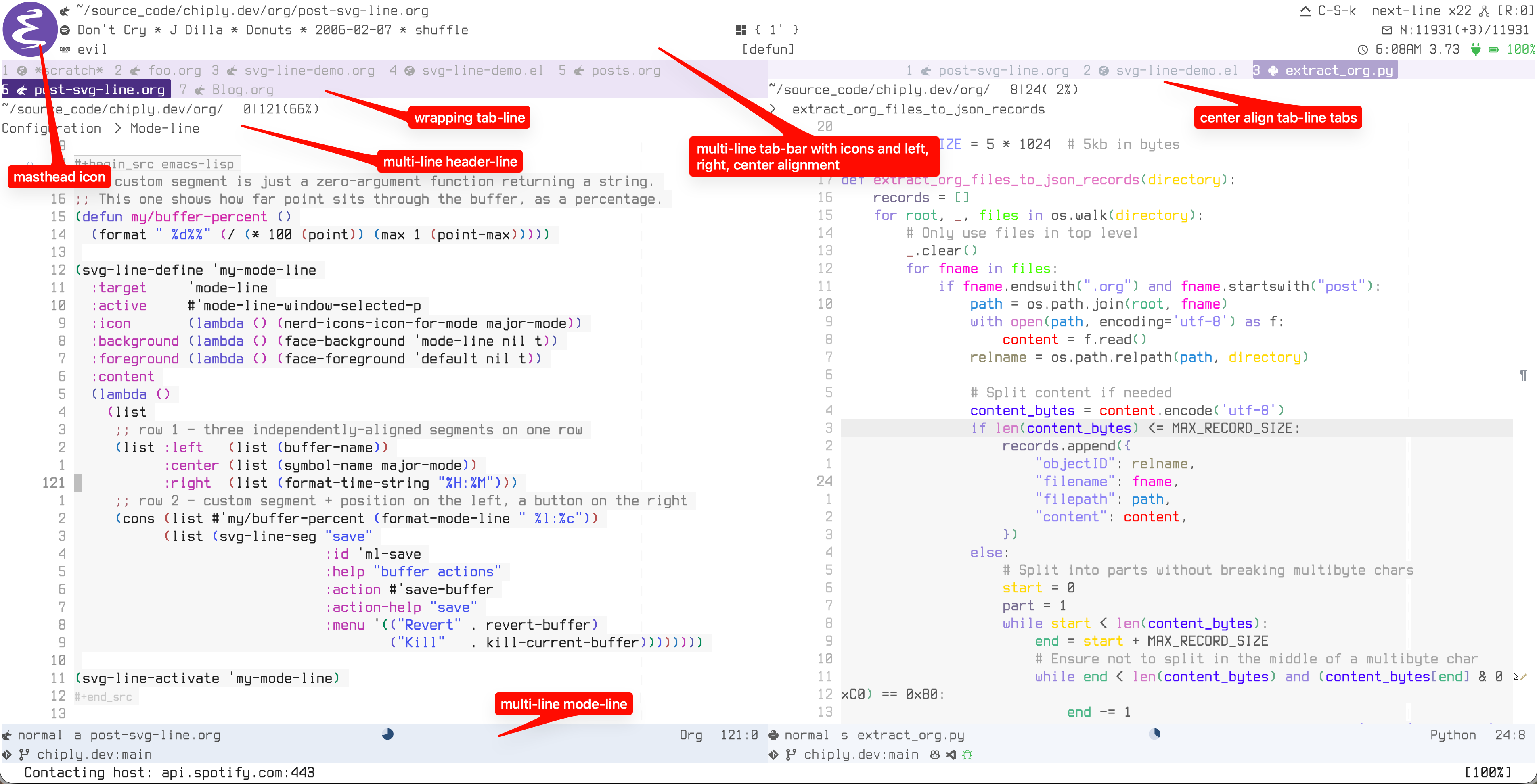
Figure 1: Every *-line in this frame is one SVG image drawn by svg-line.
2. About
Emacs gives us four status bars, the mode-line, the header-line, the tab-bar, and the tab-line (*-lines for short). These are useful for providing a dynamic 'heads-up display', for important context, like what buffer you're in, the active major mode, and really any arbitrary thing you can define.
I'm a heavy user of the *-lines in Emacs, and I have them all enabled, but the issue that has plagued me is that, natively, each one behaves differently and each has unique limitations. For example, multi-line status (necessary on my small laptop) is possible, but only in the tab-bar. Right alignment is possible in the tab-bar, but only in the last line, and this alignment feature is only available in the tab-bar. I can display icons from all-the-icons in the mode-line and header-line, but not the tab-bar or tab-line. Etc….
What I really want is consistent behaviour and configuration across all these status bars, and I want the multi-line, alignment, and icons features available in all of them. It turns out that SVG (scaled vector graphics) is the key to solving this.
Inspired by Nicolas Rougier's dual-header gist, I built svg-line, which provides this experience by utilizing Emacs's built-in SVG rendering support. At first, this approach seemed like a hack, or abuse of the *-lines, or neglect of the built-in status bar behaviour. But I kept it and created a package because I was literally shocked how well this works and how native this feels (see the screenshot and video above).
Note that even if you only use the mode-line, svg-line is still useful — likely more so, since a single status bar has to render all your indicators on its own.
3. svg-line's Features
- Multi-line everywhere, with per-row left/center/right alignment.
- A
tab-linethat wraps overflowing tabs onto new rows instead of hiding them, including with file-type glyphs, a current-tab highlight, and an unsaved tint. - Clickable anything. Any segment can carry a left-click action, a right-click menu, and hover help with a highlight. This works uniformly across all four bars, including the otherwise-uncooperative
tab-bar. - Icons as text. Using Nerd Fonts and an icon is just a character that flows with everything else. SVG rendering also enables a full-height "masthead" glyph option on status bars that can span multiple lines.
- Dynamic and animated indicators: a buffer-position pie, progress bars, active vs. inactive styling per window.
- It respects text scale. The bars track
text-scale, re-rendering crisply instead of blurring.
A meta feature is that the configuration surface is uniform across all status bars, which is a pleasant improvement over the diverse configuration strategies for the native APIs.
4. Why SVG Works
When using svg-line, each line becomes one SVG image, and SVG images are more featureful than the native text engine:
- It can be any height. Multi-row bars are now possible in every *-line.
- Everything is placed at exact pixel coordinates. Left, right, and center alignment work identically on every row.
- It draws whatever you want. Text, yes, but also wrapped tab flows, geometric progress bars and pies, and (with a Nerd Font) icon glyphs inline with the text, the same on all four lines. Anything you can render in an SVG (just about anything) is fair game.
- The engine remembers where it drew. It can detect the mouse against those placements, so clicks, right-click menus, and hover all work on any element of any line.
5. Configuration
Configuring svg-line is deliberately simple. You write a :content function that returns rows, supply it to svg-line-define, and call svg-line-activate on the defined line. This configuration pattern is identical for all four bars. The engine has two layouts: lines (the default — rows of segments, used for the mode-line, header-line, and tab-bar) and wrap (a flow that wraps, used for the tab-line).
5.1. Mode-line
5.1.1. Simple mode-line
The smallest useful line is a single row: a label on the left, the cursor position on the right.
(svg-line-define 'my-mode-line
  :target 'mode-line
  :content (lambda ()
             ;; one row: (LEFT-SEGMENTS . RIGHT-SEGMENTS)
             (list (cons (list (buffer-name))
                         (list (format-mode-line "%l:%c"))))))

(svg-line-activate 'my-mode-line)
This trivial example clarifies the pattern: define then activate:
:contentis the only required key: a function returning a list of rows. Each row is a(LEFT . RIGHT)cons, and each side is a list of segments — here just plain strings.- with no
:background,:foreground, or:active, the line picks sensible defaults and is always drawn as active. svg-line-activateenables it, andsvg-line-deactivate/svg-line-toggledisable it, restoring the nativemode-lineuntouched.
5.1.2. Rich mode-line
Here's a more complicated mode-line configuration that demonstrates svg-line's feature scope. It defines two rows, three-way alignment, a masthead icon, a custom segment, a clickable button, dynamic theme colours, and active/inactive styling:
;; A custom segment is just a zero-argument function returning a string.
;; This one shows how far point sits through the buffer, as a percentage.
(defun my/buffer-percent ()
  (format " %d%%" (/ (* 100 (point)) (max 1 (point-max)))))

(svg-line-define 'my-mode-line
  :target     'mode-line
  :active     #'mode-line-window-selected-p
  :icon       (lambda () (nerd-icons-icon-for-mode major-mode))
  :background (lambda () (face-background 'mode-line nil t))
  :foreground (lambda () (face-foreground 'default nil t))
  :content
  (lambda ()
    (list
     ;; row 1 — three independently-aligned segments on one row
     (list :left   (list (buffer-name))
           :center (list (symbol-name major-mode))
           :right  (list (format-time-string "%H:%M")))
     ;; row 2 — custom segment + position on the left, a button on the right
     (cons (list #'my/buffer-percent (format-mode-line " %l:%c"))
           (list (svg-line-seg "save"
                               :id 'ml-save
                               :help "buffer actions"
                               :action #'save-buffer
                               :action-help "save"
                               :menu '(("Revert" . revert-buffer)
                                       ("Kill"   . kill-current-buffer))))))))

(svg-line-activate 'my-mode-line)
Line by line:
my/buffer-percent— any zero-argument function can be a segment; this one returns a string.:active #'mode-line-window-selected-p— a predicate; when it's false (an unfocused window) the engine applies the:inactive-*colours instead.:icon— a full-height "masthead" glyph drawn once on the left edge, spanning both rows. This is a function, so it tracks the current buffer's mode.:background/:foreground— literal colours, or (as here) zero-argument functions evaluated on every render, so the bar follows your theme automatically.- row 1 — a
:left/:center/:rightplist puts three independently-aligned segments on a single row. - row 2 — a plain
(LEFT . RIGHT)cons. Its left side mixes the custom function with an ordinary%l:%cstring. svg-line-seg— turns a segment into a button: left-click runs:action, right-click opens the:menu, and:helpshows on hover in the echo area.
5.2. Tab-line
The tab-line is where the wrap layout is most useful: instead of scrolling overflow off the edge, it flows tabs onto subsequent rows.
(svg-line-define 'my-tab-line
  :target  'tab-line
  :layout  'wrap
  :content (lambda ()
             ;; each item is (LABEL . STATE)
             (mapcar (lambda (buf)
                       (cons (buffer-name buf)
                             (list :current  (eq buf (current-buffer))
                                   :modified (buffer-modified-p buf))))
                     (tab-line-tabs-window-buffers)))
  :current-background  (lambda () (face-background 'highlight nil t))
  :modified-foreground "#ebcb8b")

(svg-line-activate 'my-tab-line)
:layout 'wrap— switches from rows of segments to a wrapping flow; overflowing tabs land on a new row rather than scrolling out of sight.- each item is
(LABEL . STATE), where:currentand:modifiedin the state plist drive the per-tab highlight and unsaved tint. :current-background/:modified-foreground— the same value-or-function styling as thelineslayout, just with current- and modified-tab variants.
6. Acknowledgement
Credit where it's due: this started as an experiment off Nicolas Rougier's work. His SVG explorations and that dual-header gist demonstrated that this was possible, and showed me how well this approach works.